
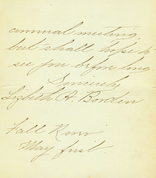
Lizbeth’s Handwriting reveals all
 I spent the day analyzing Lizbeth’s handwriting from the last page of the letter she wrote that is on sale (see post below) on eBay. As an amateur graphologist, I have an opinion regarding the Lizbeth of this note. We don’t know in what year it was penned, but it was some May 1st, in some year after she changed her name (so from 1905-1927). The image of this last page of the note has obviously been enlarged; the original being only 4¼”x4¾”. That is very small paper, much more a note than a letter (the width is that of a cabinet photo but almost two inches shorter). Cut out the size using a sheet of paper and you will appreciate the diminutive and personal nature of the paper’s size.
Even though the page is in actuality quite small, the writing covers the page, filling the space from left to right. The margins, word spacing, dimension of the individual letters, slant, continuity of the linking of the letters, the forms of connection of the letters, the speed with which the note was written as determined by horizontal tension, the letters in relation to the baseline, the formation of both capitals and lower case letters, the signature and its relationship to the rest of the letter, plus whatever small signs are revealed, all work to give us a picture of Lizbeth when she wrote this note. Some of it will of course apply to her life as a whole, but some it will be entirely tied to her state of mind during the period in which the note was written. With those disclaimers, here goes:
Take a gander at a larger version of the image here.
The first thing to take note of is the fullness of the writing on the page. There appears to be a top margin and somewhat of a lower one, but nothing resembling margins on the right or left sides of the paper. Since her writing covers all the available space in both directions, this means that the writer exhibits a stinginess or acquisitiveness and a lack of consideration and reserve. The left margin is an area that represents the past and the unconscious mind. The right margin is its opposite: the future and the outer world. Both of these areas are extended into by Lizbeth in this note. She has her feet both in the past, the present, and the future — all at the same time. Most unusual!
Next you can’t avoid noticing the slant of the letters on the page. This type of extreme right leaning slant shows a movement to greet the world and an individual concerned with what they are going to do. They fight actively to achieve goals and interact strongly with whatever situation faces them. It also shows a lack of self-control, an impulsive nature, and a low frustration tolerance.
The high upper zone of the letters indicates an extrovert and someone with a sense of freedom and vitality of spirit. Also it shows strong ambition. The extended lower zone of the letters shows materialism, self-interest, and a tendency to hoard. Don’t these two dichotomies define the Lizbeth we think we know?
The line spacing is quite even without hardly any overlapping of letters from one line to the next. This shows consistency, a desire to be understood, as well as an unadventurous person. But we must remember to take into account, here and throughout the analysis, that Lizbeth’s penmanship is quite good, and obviously linked to her copybook handwriting training as a youth. Her measured flow of letters, the straight line in which writes, adhering to an imaginary baseline, all show her to be dependable and straightforward and also predictable, and in a way, conservative.
The spacing of the words on the page is sometimes uneven. Note the lack of much space between the first word and the second — they almost appear to be running together. Then notice the bigger space before the word “hope” and then lower down the bigger space between “May” and “first”. This shows an inconsistency that translates into changeable social attitudes and insecurity. The narrowing shows a need for human contact and an easy blunt manner; one who clings to those they hold dear, both people and possessions. Insecurity expresses itself in a need to be surrounded by others.
With this image, one cannot be accurate as to the actual size of the letters, but we can say that the letters on the page are taller rather than smaller, which means that for the writer, approval is very important. This also denotes ambition, farsightedness, a lack of consideration, and a lack of modesty or tact.
The writing is lean, with the middle zone higher than wide. This shows someone who feels restricted or held back; someone who has a gift for abstract thinking and concentrating on essential facts. It also shows someone who automatically controls their feelings and imagination; the withholding urge rising to the level of a personal virtue.
There is great continuity in this sample (the linking of the letters). This shows her to be rational and realistic in following through of ideas, and it is hard to deflect her from her course of thoughts and efforts.
The way the letters are joined is called the form of connection. They are like footsteps, and show us the way a person moves through their life. Since this sample obviously shows a copybook connection, we can say that this Lizbeth shows a tendency to conform — she walks correctly and carefully across the world space and values convention, despite other signs that deny this.
This sample shows a great vertical tension. Note the very high extending l, t, f, p, and b, and the very low extending y and g. This exaggeration in the upper zone indicates a preoccupation by ideas, a person that scorns mental precepts and feelings in favor of the abstract vision in her head. The lower zone is the area of survival and animal instincts. Here it shows Lizbeth to be sober, materialistic, and threatened and insecure when her values are questioned. The leftward turning downstrokes of the g shows a great capacity for sexual enjoyment, but the length and trailing nature of the formation of the lower part of those g’s also shows one who is quite unknowledgeable about sex. The y in “Sincerely” does a similar thing doesn’t it, but this letter represents a person’s attitude towards money. This odd y means that Lizbeth has a great deal of monetary frustration.
As noted above, the upper and lower parts of the letters do not entangle with the letters above or beneath them, except in one instance. This is significant. It shows a person who avoids entanglements in her social world.
The small signs we look for are word beginnings, endings, t-bars, i dots, and capitals. Notice the beginning formations of each word. Notice the unbending nature of them and how they shoot off slightly to the left, but do not curl up or down. This shows that the writer has great tensions from the past and is resistant to change. She is hanging onto something, and they point to the past.
The endings of the words show an attitude toward the ending of one thing and the beginning of a new thing. Here we view someone’s social behavior. This upward movement of the last letter of words shows a search for knowledge, someone high reaching, and an unusual or mysterious person. She also expresses with those letters a lifting of spirits and some sort of inspiration. So the start is connected to a past she cannot let go of, and the ending shows a her reaching high for something better.
The t-bars are very interesting in this sample. Note how only one T is crossed, the one in the first line, and it is crossed way up at the top of the formation of the letter. This indicates a strong inspiration of individual spirit. But also note, it only happens once. The other t-bars are way way off to the right of the letters, almost appearing as mismarks on the page. This shows a drive out of touch with reality, and a rushed and eager personality. She wrote this thing fast! Interestingly, the t-bars off to the side of the t’s also can be a sign the writer is elderly, so since we don’t know when Lizbeth wrote this note, we cannot completely assume it was not because she was old.
The capitals on this page are huge. Capitals show how our unconscious attitudes are connected with our willingness to defer to authority and where our sense of importance lies. It shows ego. And look how big Lizbeth’s capital letters are! Hmm. Interesting, wouldn’t you say? Their oversized nature shows someone who both demands and defers to authority (which is a good thing). It shows someone who is a visionary, is independent, and haughty. It shows someone who masks their feelings of inferiority (there is that word again). The good form of the letters shows a confident self-projection. The peaked cap of the capital B, where the top part stretches over the letters that follow (take a look and come back, I’ll wait), show a great maternal instinct and an authority that protects. The capital R’s fancy extension below the baseline shows vanity.
The i-dots show a person’s capacity for concentration and accuracy, but note how Lizbeth’s dots are far far away from the letter they are connected to! This shows a fast thinker and their height way above where they should be in the normal writing, shows a dreamer.
There are four types of connecting strokes we can examine: garlands, arcades, angular, and thread. The garland is a rounded, cup-like stroke, and the one most taught in Western schools. It is the quickest and most natural connection to make between letters. Lizbeth’s garlands are very deep and show a great capacity to be open and receive. The arcade is the umbrella look to the letters in cursive writing. The more arched they are the more artistic and protective the subject is. The thread of Lizbeth’s writing is steady, which shows a logical, adaptive, and persistent person.
Finally, let’s take a look at that signature! Wow is it big in comparison to the other writing. Notice how it takes up a whole line of writing. Since your signature is your self-image, or how you want others to perceive you, this sample shows self-importance and an irritation at being enclosed or curbed by petty restrictions. This signature is larger than the other words, which indicates that the writer counts herself as the most noteworthy presence around. Notice how the signature retreats to the left — and remember the left is the past. Hmm. The closeness of the signature to the text shows a considerable involvement with the subject of the letter.
Note the difference between the first name and the last. Note how the last name “Borden” takes up more space yet has less letters than “Lizbeth”. The forename is “ME” and one’s identity. The last name is one’s sense of family and connection to it. The smaller, closer spaced letter in Lizbeth shows unhappiness within the writer, and an insufficient confidence to be free and open with who they really are. But that “Borden” sure is big, isn’t it? Still proud of that name after all these years.
If you want to read further about graphology and do a little of your own, I suggest these titles:
Handwriting Analysis by Karen Amend, Mary S. Ruiz, 1980.
Instant Handwriting Analysis by Ruth Gardner, 2002.


