Page 1 of 1
LizzieAndrewBorden.com gets a makeover
Posted: Wed Sep 17, 2008 4:57 pm
by Stefani
Last night I uploaded the new look to LizzieAndrewBorden.com. I hope you all like it. I decided I was not only bored with the old layout/look, but that the site needed a classier more modern look. It took about four days to do, but I am rather pleased with the result.
If any parts don't work, please use this thread to let me know and I will fix the problems when and if they arise.
Thanks!
http://lizzieandrewborden.com

Posted: Wed Sep 17, 2008 6:25 pm
by snokkums
I tired it and it works fine for me. It's pretty nice. Was just surfing thru it.
Good job Stefani!
Posted: Wed Sep 17, 2008 7:10 pm
by Smudgeman
Did not work at all for me, but I am on AOL, you know we have had problems before. None of the tabs take me anywhere?????????? It just stays on the main site page.
Posted: Wed Sep 17, 2008 7:57 pm
by joe
I like it, Stef! Good work. No frills....just the way websites should look.
Posted: Wed Sep 17, 2008 9:15 pm
by kssunflower
Definitely an improvement. I love the paranormal link!
Posted: Wed Sep 17, 2008 10:39 pm
by Constantine
Works fine, but I like the old one better. Oh well, I'll get used to it.
Posted: Thu Sep 18, 2008 4:51 am
by Nadzieja
Good job Stef, It looks great. It must have taken you awhile to do it. I still can't get a card to go through here for someones birthday!!!!! so I can't imagine doing a whole website.
Posted: Thu Sep 18, 2008 7:55 am
by Smudgeman
It seems to be working fine this morning, go figure. Good job Stef.
Posted: Thu Sep 18, 2008 10:26 am
by twinsrwe
It worked fine for me. The new look is very different from the old look, and it is definitely something I'm going to need to used to; although, I did find it easier to read - that is the black lettering on a white background is easier to read than the white lettering on a black background. However, the white lettering on a black background is much more mysterious, which, as we all know, is what the Borden case is full of. Guess that is what I liked about the old look. I think in time, we'll get used to the new look. Good job, Stefani!
Posted: Thu Sep 18, 2008 10:35 am
by augusta
Beautiful job, Stefani! Your hard work paid off. I think it's probably going to be easier to use.
All of the titles of the different places on the site don't appear at once, tho. I did like that about the other one.
I did love the other one. I enjoyed all the different colored Lizzies. And especially how you had the name of the website 'appear'.
This is quite a change, from the 'most colorful' to 'muted'. It might be an idea for the future, to maybe put a little Victorian decoration on the page somewhere, somehow.
But this is just first impression. I may love this new one, too, in a month or so.
Posted: Thu Sep 18, 2008 7:19 pm
by Smudgeman
The background is a little bleak, maybe you could put different dress patterns in the background? I really liked the "Andy Warhol" type theme in your last change, this one needs a little tweeking I think?
Posted: Fri Sep 19, 2008 6:09 am
by Fargo
I liked the old one better, but they are both nice.
As long as it gets me here with the rest of you, that's the main thing.

Posted: Fri Sep 19, 2008 5:59 pm
by andrea
I like the new look and it seemed to work fine when I wandered around. Although the former look was great too, it's nice to have a change once in awhile. Whatever the appearance - the site is a wonderful resource for all things Borden!
Posted: Fri Sep 19, 2008 10:18 pm
by FairhavenGuy
I'm having a problem with it. The red rectangular whatchamacallit that lists the various pages to click (How's that for technical language?) overlaps left part of the text on each page.
For example on the first "Crime Library" page, the first five or six characters of the left side of the text are covered by that index block thingy all the way down to "When her elderly father. . ."
I first viewed it using the standard aol browser, then I switched over to Windows Internet Explorer and it was the same.
So, I guess I liked the old style better.
Posted: Sat Sep 20, 2008 2:27 pm
by Stefani
FairhavenGuy, perhaps your computer screen is small? Can you adjust the size of your browser's viewing window? By dragging the lower right hand corner to the right and down to fill your screen? Or enlarging the screen itself by toggling the windows buttons on the upper right? Would you, for me, try this and see if now everything is in place?
I tested the site on various browsers and it appeared to work fine on Firefox, Safari, Opera, but don't have IE. Maybe Harry would test that one for me?
Thanks! I wanna make this right for everyone.
Posted: Sat Sep 20, 2008 3:33 pm
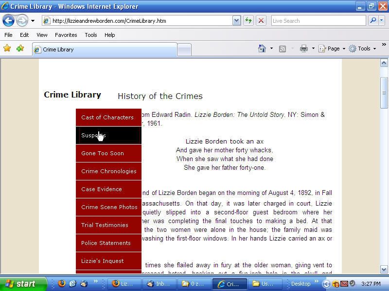
by Harry
I tried it with IE7 and yes there is an overlap. Here tis'
I'll try it with Netscape, Sea Monkey and Chrome. (sounds like a law firm!)
Posted: Sat Sep 20, 2008 3:49 pm
by Harry
Tried it with 6 browsers. It worked okay with:
Netscape 9, Chrome 0.2, SeaMonkey 1.1 and Safari for Windows 3.1.2
On Avant and IE7 it overlapped. Avant uses IE7 as its core so it would have the same result.
Don't know if this is the problem but when you go to the start page IE7 was the only one where a slide bar (at the bottom) has to be used.
Posted: Sat Sep 20, 2008 4:25 pm
by FairhavenGuy
What Harry's screen shot showed is exactly what I got.
Both at work and at home on two different size screens.
My screen was plenty wide enough to hold the full image, it was just that the index block was out of place.
Guess I gotta start using a different browser.
Posted: Sat Sep 20, 2008 10:02 pm
by Stefani
Let me try a few things and get back to you when it is "fixed" and you can test again. Thanks Harry, thanks everyone, thanks Fairhavenguy!
Posted: Sat Sep 20, 2008 11:21 pm
by Stefani
Well, try it again. I moved the menu to flush left of the sidebar. See if this works? Thanks.
Posted: Sun Sep 21, 2008 7:48 am
by Harry
Stef, sent you an e-mail.
Posted: Tue Sep 23, 2008 11:39 am
by FairhavenGuy
It's working for me now!
Thanks, Stef and Harry.